
Flippa got a new look yesterday and we went through the site and analyzed the changes. The most important ones are shared here.
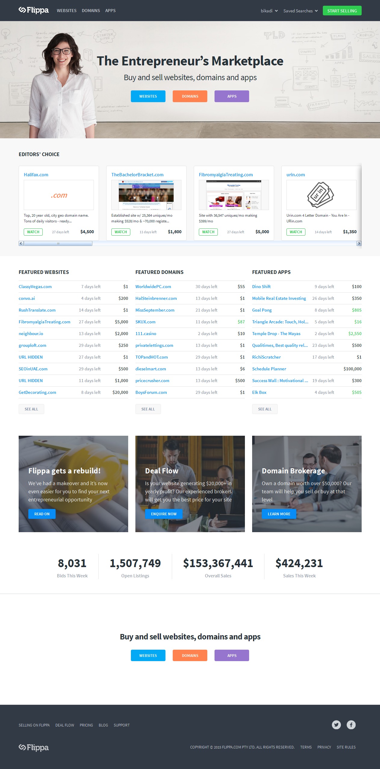
The redesigned Flippa homepage got a makeover
The main changes are the followings:
- Main menu has been redesigned. It is very clear now: you can choose from websites, domains or apps to browse listings. There is an on hover submenu for narrowing the listings, like new or established. There is a separated button for the user’s dashboard (this is not working for me on mobile at the moment) and selling.
- Homepage has been redesigned. As a seller, I am more interested in the sales consequences of the redesign than the nice look but I have to admit that it looks better. The most important part of the homepage was the top 3 listings at the top, called “Spotlight listings” that cost $150/day. While it was a very expensive promotion option, it was extremely effective at the same time to boost an auction.
It seems we can say goodbye to Spotlight listings, Editor’s choice took over this position in the new design. Looks like Flippa does not want to sell their best banner position for anyone who has money and tries to promote maybe low quality websites or domains but they want to boost their own choices. It is an understandable move although selling almost-Editor’s choice quality domains will be more difficult without having this option. Since there are more than 3 Editor’s choice, Flippa had to place a horizontal scrollbar at this position. As far as I know, users hate horizontal scrollbars and most of them will not move this frame to the right. Thus, only Editor’s choice in the first 3 positions will be positively affected, so it would be important to know, what is the ordering rule of these listings.
Below the Editor’s choice, featured actions are promoted by type, so this is what we got from a listing’s upgrade. - Listing types got a secondary homepage, so e.g. there is a homepage of the domains under flippa.com/domains. It means that one more click is needed to check the not promoted listings (and those domains will be at the very bottom of the list), which are very buried now. On the domain homepage, featured auctions got the spotlight position, again with a horizontal scrollbar. Below that, Editor’s choice, reserve met and ending soon domains are promoted – it is the same structure that they use in their newsletter. The “All domains” button is almost hidden from users’ eyes.
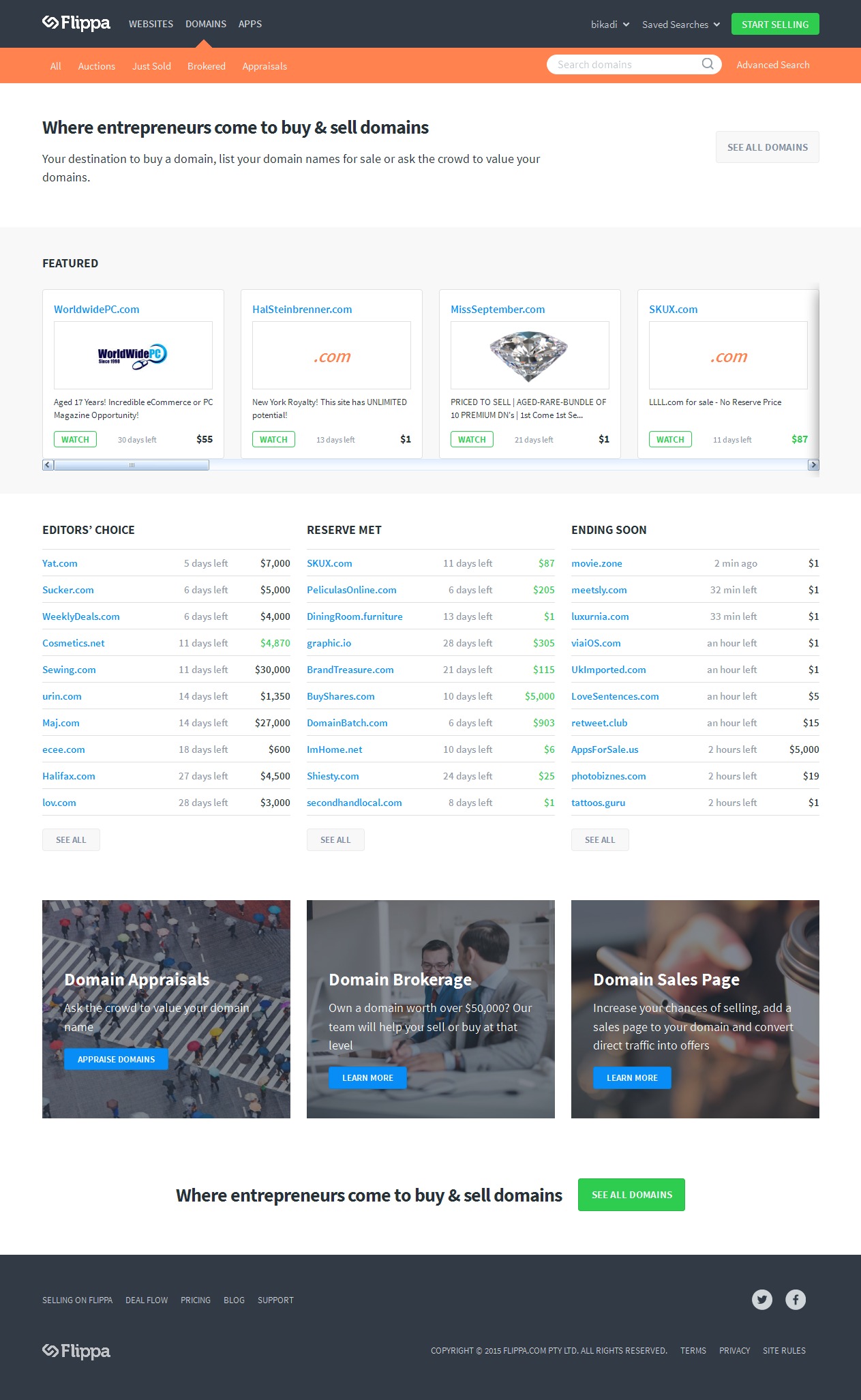
Main page of the domain auctions at Flippa
The motivations and consequences are quite clear. The balance of the free and paid listings are moved towards the paid listings. The only option for a free listing to get some views is to start from $1 and hope for a bidder to meet the reserve and than be showcased at the domain’s homepage. Or get an Editor’s choice pledge but chances are usually very low for this latter. Starting on $1 without reserve and not promoting the listing can be very risky for a valuable domain. I would rather say that featuring a listing is a must in the new design to have a chance to sell a domain for a reasonable price.
UPDATE: the annoying iframe with horizontal scrollbar has been replaced with a javascript gallery. Much nicer!